
✤ Concept project based on a creative brief challenge ✤
Live, Laugh & Love
Live, Laugh & Love
Oliv is a sleek olive oil brand bringing minimal design, Mediterranean roots, and modern lifestyle appeal into everyday kitchens.
Oliv is a sleek olive oil brand bringing minimal design, Mediterranean roots, and modern lifestyle appeal into everyday kitchens.
The Vision: Elevating a Daily Ritual
The Vision: Elevating a Daily Ritual
The Vision: Elevating a Daily Ritual
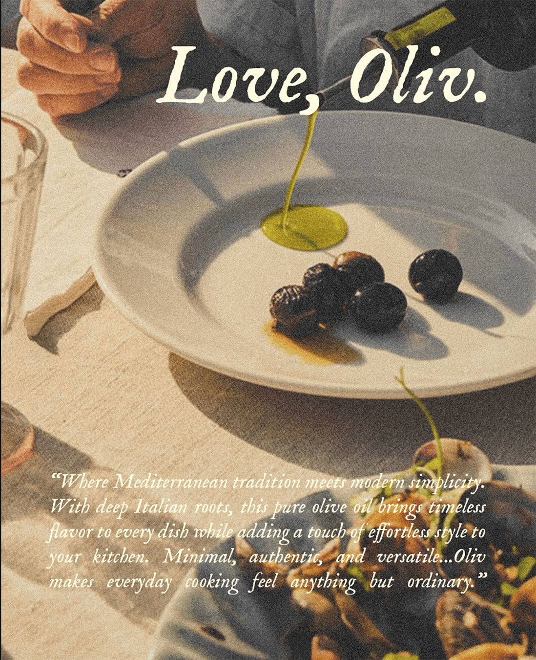
Oliv was born from a desire to explore the intersection of Mediterranean heritage and the modern "slow living" aesthetic. The goal was to transform a kitchen staple, olive oil, into a centerpiece of design. I wanted to create a brand that doesn't just sit in a cabinet but earns its place on the countertop as a lifestyle object.
The Challenge: Warm Minimalism
Balancing Heritage and Trend: The main challenge was to respect the traditional roots of olive oil while appealing to a design-conscious, younger audience (Gen Z & Millennials). It had to feel authentic, not industrial.
Visual Fluidity: Capturing the essence of the product without being literal was key. I experimented with typography until the logo achieved a "liquid" silhouette, mimicking the viscosity and golden flow of the oil itself.
Evoking Sensation: In a digital space, the challenge is to convey a tactile experience. I utilized grainy textures and a creamy, buttery color palette to evoke the warmth of a Mediterranean afternoon and the sensory pleasure of a shared meal.
The Creative Approach
The Creative Approach
The visual identity is built on the principle of "sophisticated simplicity," relying on generous negative space and a clear hierarchy to communicate quality.
The visual identity is built on the principle of "sophisticated simplicity," relying on generous negative space and a clear hierarchy to communicate quality.
The Creative Approach
The visual identity is built on the principle of "sophisticated simplicity," relying on generous negative space and a clear hierarchy to communicate quality.

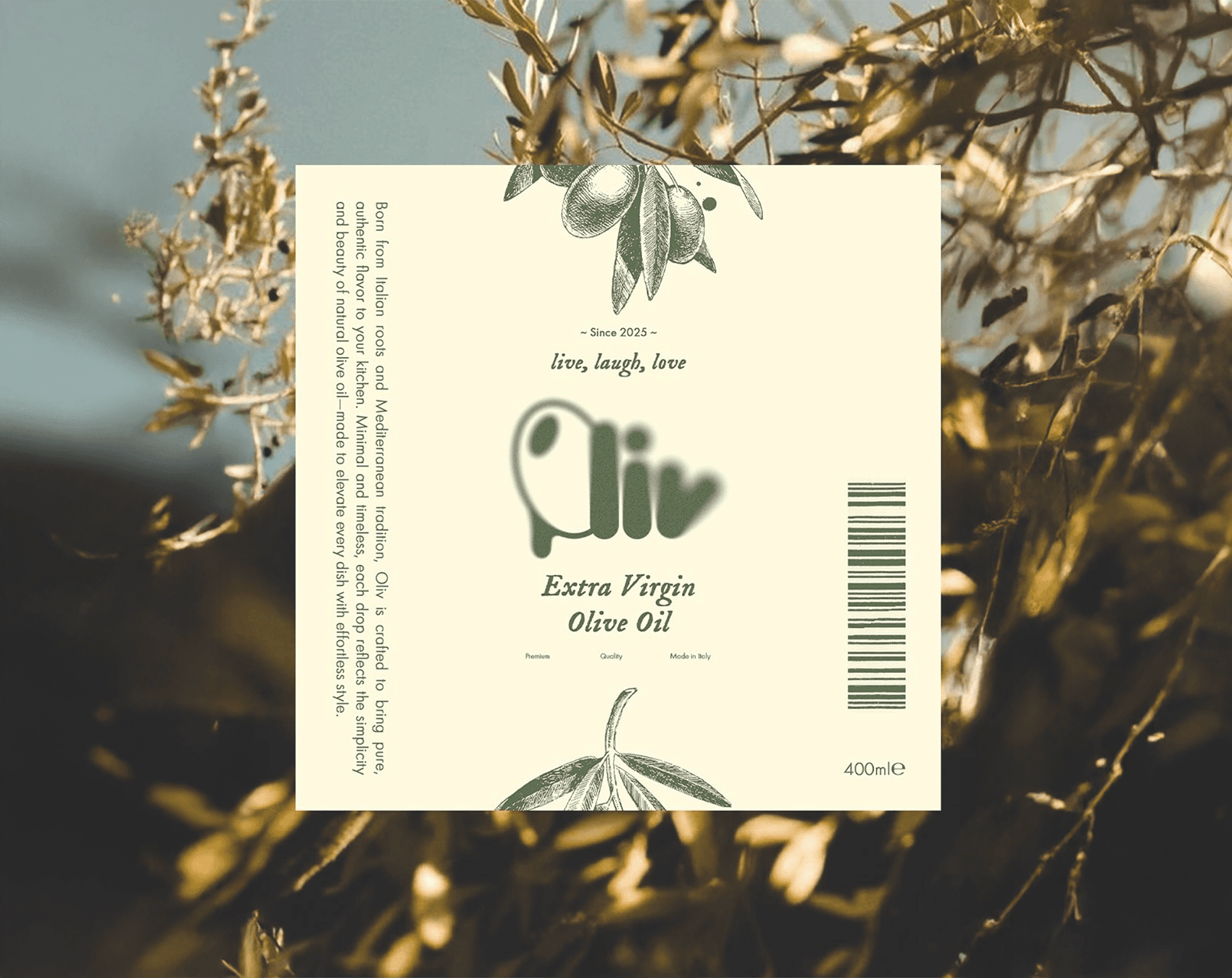
The Logotype
The Logotype
The Logotype
The centerpiece of the brand features thick, curved lines and custom letterforms. Its fluid shape acts as a visual metaphor for a drop of oil, creating a friendly yet premium personality.
The centerpiece of the brand features thick, curved lines and custom letterforms. Its fluid shape acts as a visual metaphor for a drop of oil, creating a friendly yet premium personality.
Color Palette
Color Palette
I moved away from harsh whites, opting instead for a warm "butter" cream and a muted olive green. These tones, paired with metallic gold accents on the hardware, reinforce the "Extra Virgin" quality.
I moved away from harsh whites, opting instead for a warm "butter" cream and a muted olive green. These tones, paired with metallic gold accents on the hardware, reinforce the "Extra Virgin" quality.
Imagery & Texture
Imagery & Texture
By applying a film-grain effect and integrating fine botanical illustrations, I grounded the modern branding in a nostalgic, analog feel that suggests craftsmanship and purity.
By applying a film-grain effect and integrating fine botanical illustrations, I grounded the modern branding in a nostalgic, analog feel that suggests craftsmanship and purity.

Why This Project?
Why This Project?
Why This Project?
I was drawn to the discipline of "subtraction", the art of knowing when to stop. Designing for a premium product requires precision; every element must serve a purpose. This project allowed me to prove that a brand doesn't need to be loud to be confident. It’s about creating a mood—one of calm, quality, and effortless style.
Oliv is an exercise in restraint. The process reminded me that the most impactful brands are those that evoke a feeling. Through fine textures and a focused color story, I aimed to turn a simple ingredient into a storytelling experience.
