
✤
Intensive creative competition ✤
2025 / 2026
2025 / 2026
The alternative school
The alternative school
Three briefs. Two teammates. One competitive environment built around real pressure.
The Alternative School was an intensive creative lab where strategy met execution under strict deadlines, two month-long projects and one 24-hour sprint. Weekly brainstorming sessions turned into debates, sketches, rewrites and visual experiments. Working with a partner from a different background forced clarity: every idea had to survive questioning, every visual had to justify its existence. The result was not just campaigns, but a process of learning how to think, defend and build ideas as a team.
BRIEF #1 - Ursus Corporate Campaign
Everyone knows the beers. Almost no one knows the company behind them.
The brief asked us to reveal Ursus Breweries as more than a producer, to frame it as a cultural and social actor with history, people and responsibility at its core. We started from a simple tension: visibility of products versus invisibility of identity. Our concept transformed corporate communication into storytelling, shifting focus from bottles to the ecosystem of people, craft and long-term impact.
Visually, we aimed for restraint and intention. Clean compositions, generous white space and editorial clarity mirrored the idea of transparency, a company stepping forward and speaking about its values. Every visual element served the narrative: heritage connected to future, scale humanized through faces, and strategy translated into a language accessible beyond advertising.

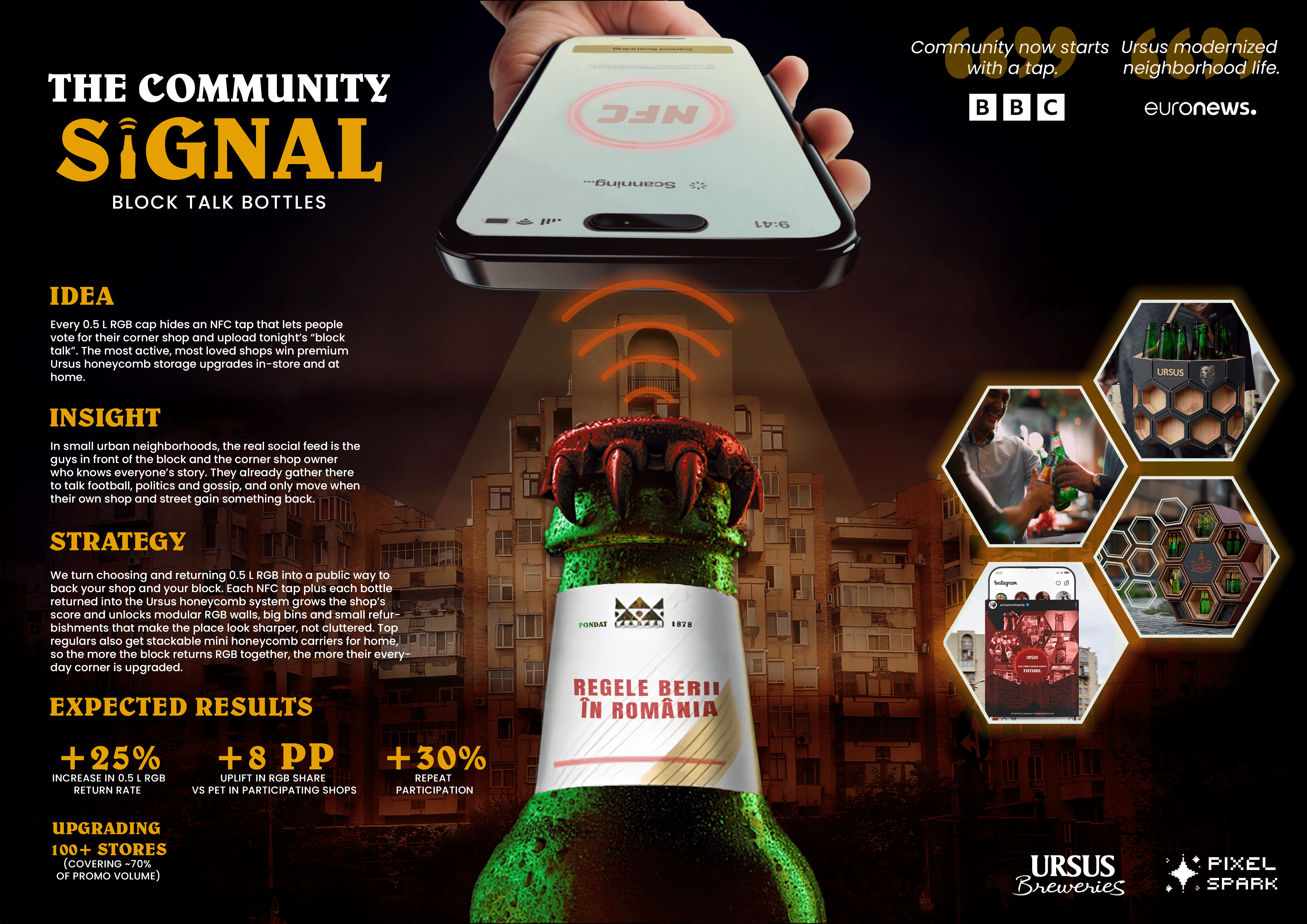
BRIEF #2 - RGB Bottle Promotion
The problem wasn’t the bottle. It was the broken ritual around it.
Returning glass used to be a social habit; now it’s an inconvenience. This brief pushed us to rethink sustainability not as an environmental lecture, but as a neighborhood behavior shaped by trust and routine. We repositioned the RGB bottle as a social connector, an object that belongs to shared moments in small shops, street corners and everyday conversations.
Instead of a classic promotion mechanic, the campaign imagined a community movement. Visuals celebrated local culture: imperfect, warm, human. The bottle became a symbol of continuity, reused, passed through hands, embedded in daily life. Design wasn’t decoration; it was infrastructure for belonging.
BRIEF #3 - 24h Young Lady Campaign
24 hours to challenge a stereotype that has existed for decades.
The brief asked us to dismantle the cliché of Romanian beauty as surface and rebuild it as substance. We reframed beauty as evidence of inner architecture, intelligence, talent, resilience. The head became the hero: what’s inside and what’s outside forming one identity.
Time pressure forced instinct. Decisions were immediate, debates sharp, edits ruthless. The campaign evolved into an ecosystem where style was not decoration but translation of personality. Digital, editorial and experiential layers worked together to amplify real voices and real stories.
The jury later highlighted the project as one of the strongest 24-hour solutions, not because it was polished, but because it was clear, human and emotionally precise.
